
Clever Cost · Logo redesign · 2023
A new logo instead of a lawsuit
When MobilePay flagged Clever Cost's logo as too similar to their own, I made the case for redesigning rather than defending it, then led the redesign from first sketches to a finished identity in about four weeks.
In brief
Turning a legal problem into a design brief.
- Challenge
- MobilePay objected to the similarity between their logo and Clever Cost's. Leadership's first instinct was to defend the old logo.
- Approach
- Argue for a redesign, explore widely, then narrow down together with the CPO and the whole company through two rounds of feedback.
- Result
- A new logo with a clearer idea behind it, live about four weeks after the letter arrived. We never heard from MobilePay again.
- Role
- Digital designer, redesign lead
- Timeline
- About 4 weeks · Autumn 2023
- Worked with
- CPO, leadership, whole staff
- Delivered
- Logo · App icons · Social banners
The trigger
Two blue squares, one problem.
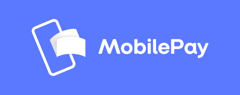
Clever Cost's original logo was a stack of white paper sheets on a blue square. MobilePay, one of the most recognisable brands in Denmark, uses a white folded card on a blue background. Their lawyers noticed.
Leadership's first instinct was to defend the old logo. I was working closely under our CPO at the time and told him I thought it was the wrong fight: a legal battle against a company far bigger than ours would cost more than a new logo, for a mark that wasn't especially strong to begin with.
He agreed, and gave me room to show what a redesign could look like.
The redesign wasn't a nice-to-have. It was the cheaper, faster way out of a real problem.

Phase 1 · Going wide
Every direction, before any decision.
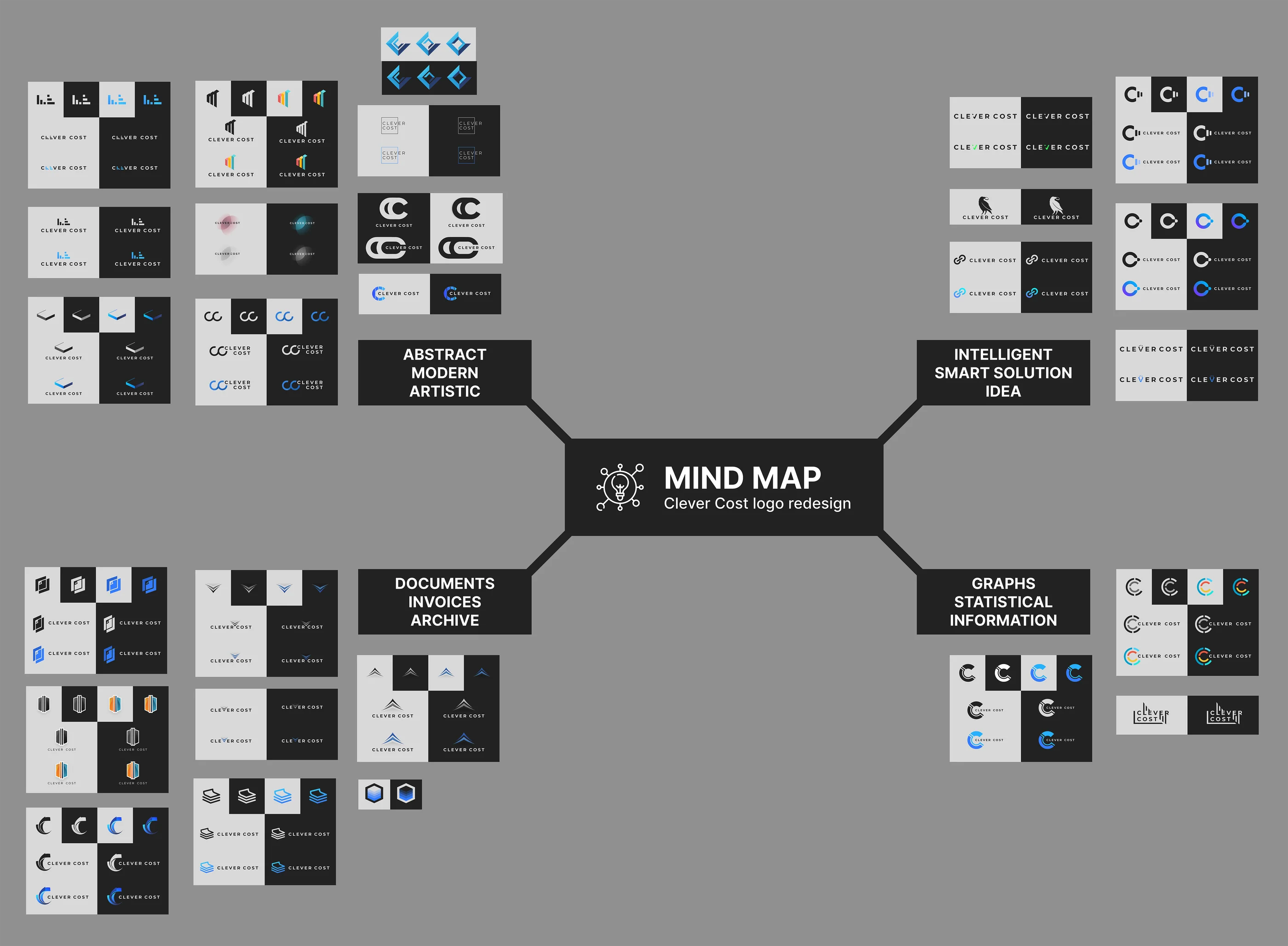
Over a few days, fitted in between other assignments (we were a small team), I produced as many logo ideas as I could, then sorted them into four territories based on what they said about the product: abstract and modern; intelligent and smart; documents, invoices and archiving; and graphs and statistics.
Each idea was tested on light and dark backgrounds from the start, so a weak idea showed itself early. The CPO was impressed with the range, and together we picked the strongest directions to take forward.
Going wide first made it easier to agree on a direction later. Everyone could see the options had actually been explored.
Phase 2 · Narrowing down
Letting the company vote, then pushing the winner further.
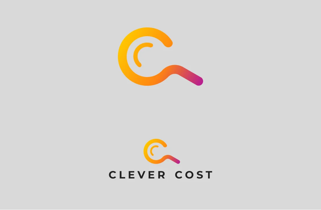
The strongest ideas from the mind map were developed into six refined candidates. These aren't copies of the sketches. Each one grew out of the best parts of an earlier idea. I presented them to the entire staff, including the owner, and everyone voted.
The winner was a C shaped like a magnifying glass: Clever Cost looks closely at your invoices so you don't have to. The idea was right, but the execution wasn't there yet. The gradient, the thin loose stroke and the long handle wouldn't hold up at small sizes.
So the magnifying glass kept evolving. It became a solid, geometric C with the lens cut out of it, simple enough to work as an app icon and bold enough to sit inside the wordmark.
The final logo isn't on the Phase 2 sheet. It's what the winning idea became once it had to work in the real world.


Phase 3 · Refining the message
Where the lens sits changes what the logo says.
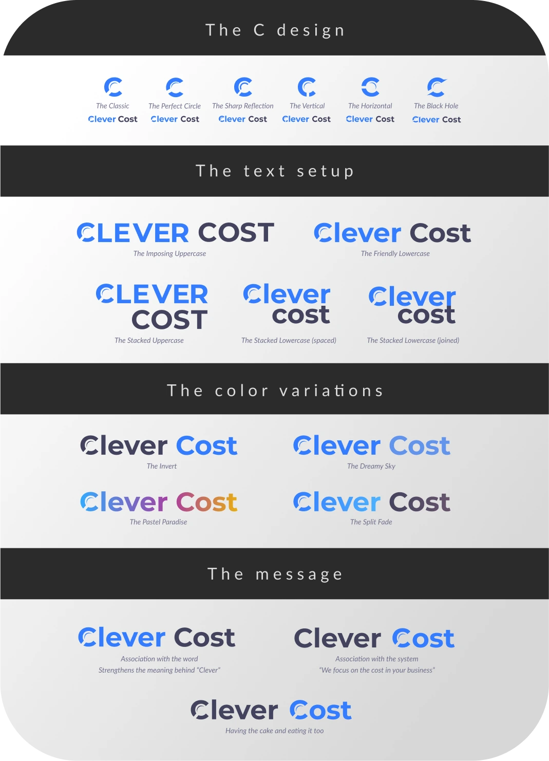
With the direction settled, I put together a refinement sheet covering the details: six variations of the C shape, five ways to set the type, four colour treatments, and three ways to place the mark.
The last one mattered most. Put the magnifying glass on Clever and the logo is about being smart. Put it on Cost and it's about the product: we focus on the costs in your business.
I saw my job as showing leadership what each option would mean, not picking for them. They chose Cost, and I agreed. It tied the logo directly to what the product does.
A good presentation doesn't just show options. It explains what each option means.
 Open full size ↗
 The finished identity
Clever in blue. Cost under the lens.
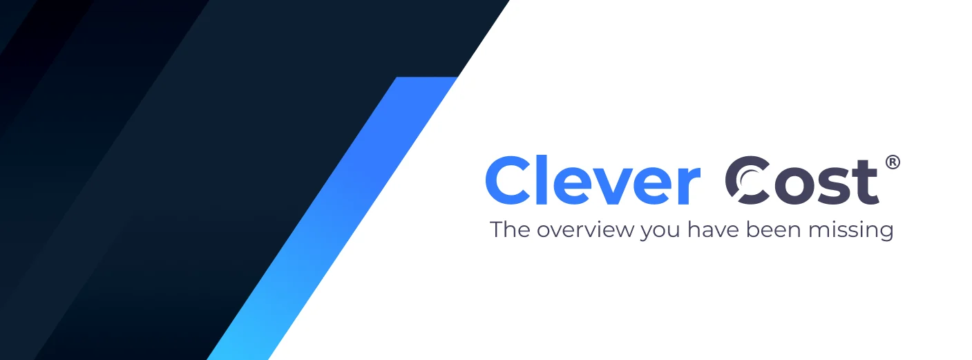
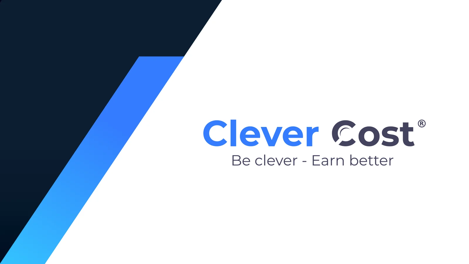
Friendly lowercase type, the brand blue kept from the original, and the magnifying glass on Cost. The mark also works on its own as an app icon, and the identity carried straight over to social media.





Outcome
Problem solved, brand improved.
The redesign replaced a legal dispute with a logo the company could actually stand behind.
- Speed
- About four weeks from MobilePay's letter to the new logo going live.
- Rollout
- Rolled out across Clever Cost's channels, from the product to social media.
- Resolution
- We never heard from MobilePay again. No court case, no legal costs.
From the CPO at Clever Cost
“Thomas possesses an incredible eye for detail and a rare ability to transform concepts into visually stunning designs. Not only does he handle complex tasks with ease, but also demonstrates a knack for generating multiple viable solutions with a deep understanding and empathy for user needs. He consistently demonstrated a remarkable ability to reflect on, identify, and pinpoint unseen challenges and opportunities. This significantly contributed to the release of quality features resulting in a high customer satisfaction.”