
Paperturn · Pricing & sign-up UX · 2019
From pricing page to first login
During my internship at Paperturn I redesigned the path a new customer takes: the pricing page, the checkout, the free-trial sign-up and the first emails they receive.
In brief
One path, designed step by step.
- Challenge
- Paperturn sells an online flipbook tool by subscription. The old pricing page listed long feature columns in coloured boxes and asked visitors to pick an amount from a dropdown in each plan.
- Approach
- Read up on best practice for pricing pages, compared competitors' pricing and checkout flows, and turned the findings into a short list of principles before designing.
- Result
- A new pricing page, a three-step checkout, a redesigned trial sign-up and two onboarding emails, approved by the CEO and handed to a developer.
- Role
- Graphic design intern, sole designer
- Timeline
- Aug – Nov 2019 · 4 months
- Worked with
- CEO (feedback, approval) · Developer
- Delivered
- Pricing page · Checkout · Trial page · 2 emails
Research
Start with what already works.
Before drawing anything, I read articles on what makes pricing pages and checkouts convert, and went through competitors' pricing pages and payment flows to see which patterns kept coming back.
I wrote the findings down as plain notes: highlight the plan you want people to buy, answer questions before they come up, show familiar logos, and remove every distraction once someone starts paying. Those notes became the brief for the rest of the work.
“Familiarity often trumps logic and innovation.” One of the lines from my research notes, and a good rule for a checkout.

The pricing page
Every choice has a reason.
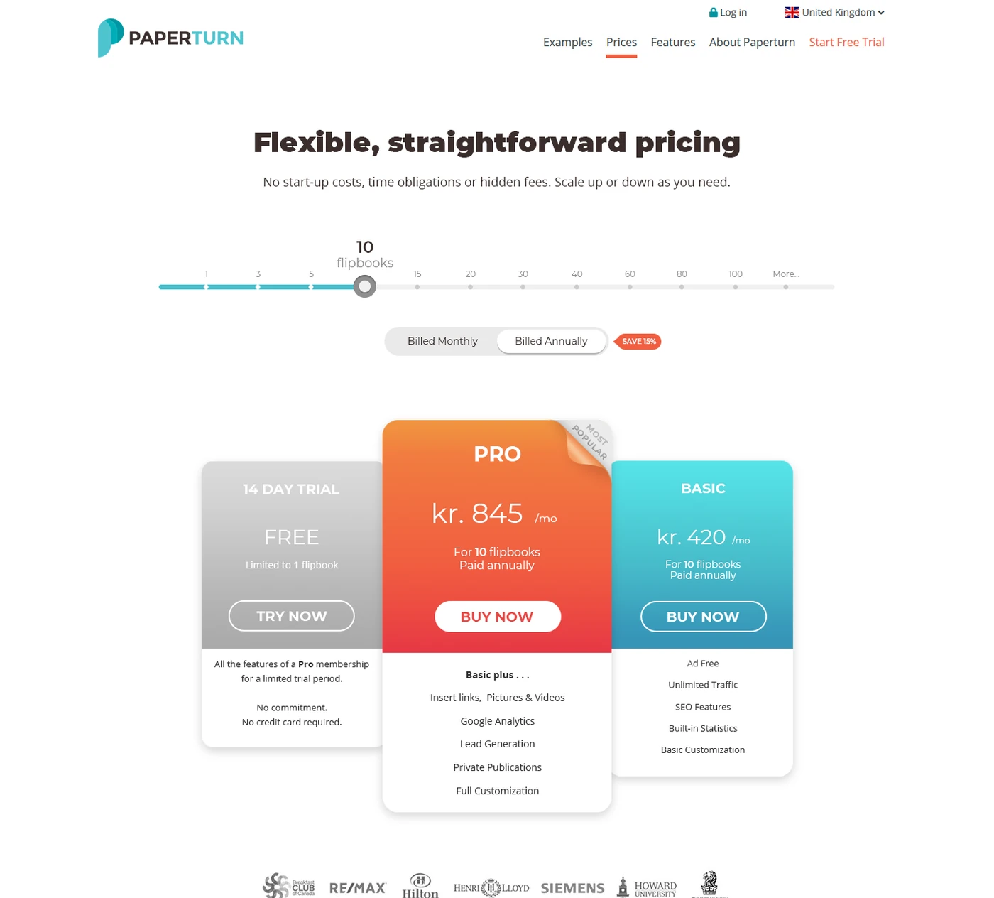
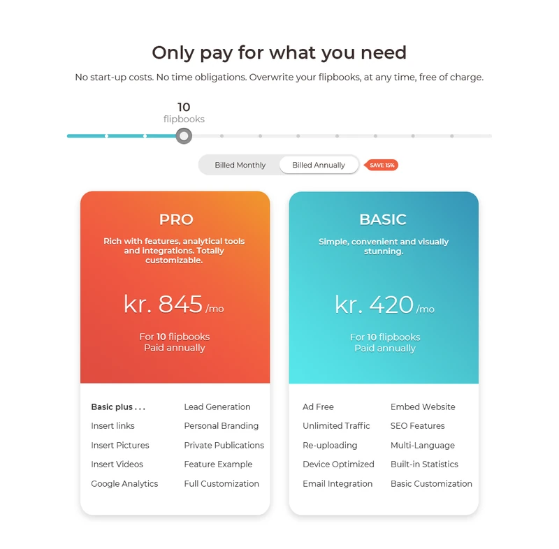
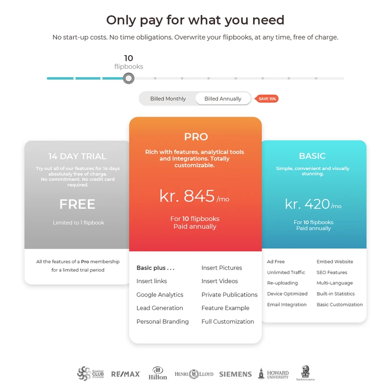
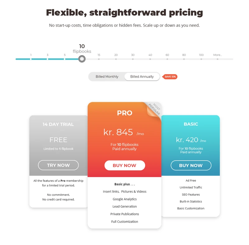
The first version kept two plans side by side. The second added the free trial as a third option and made Pro the largest card. The final version tightened all three, gave each card a clear buy button and let one slider set the number of flipbooks for every plan at once, with a monthly and annual toggle above.
Each version went to the CEO for feedback, and the final one was approved for build.
Three quick iterations, each one a little calmer than the last.
- Version 1
- Version 2
- Final
From research note to design
- “Highlight the plan you really want people to buy.”
- Pro sits in the middle, raised above the others, in Paperturn's orange.
- “Avoid analysis paralysis.”
- The first view is three plans. The full feature comparison sits below them.
- “Add logos of partners to the price page.”
- A row of client logos directly under the plans.
- “An FAQ on the price page reassures customers.”
- Answers to the most common questions close the page.

Checkout
A checkout with nothing in the way.
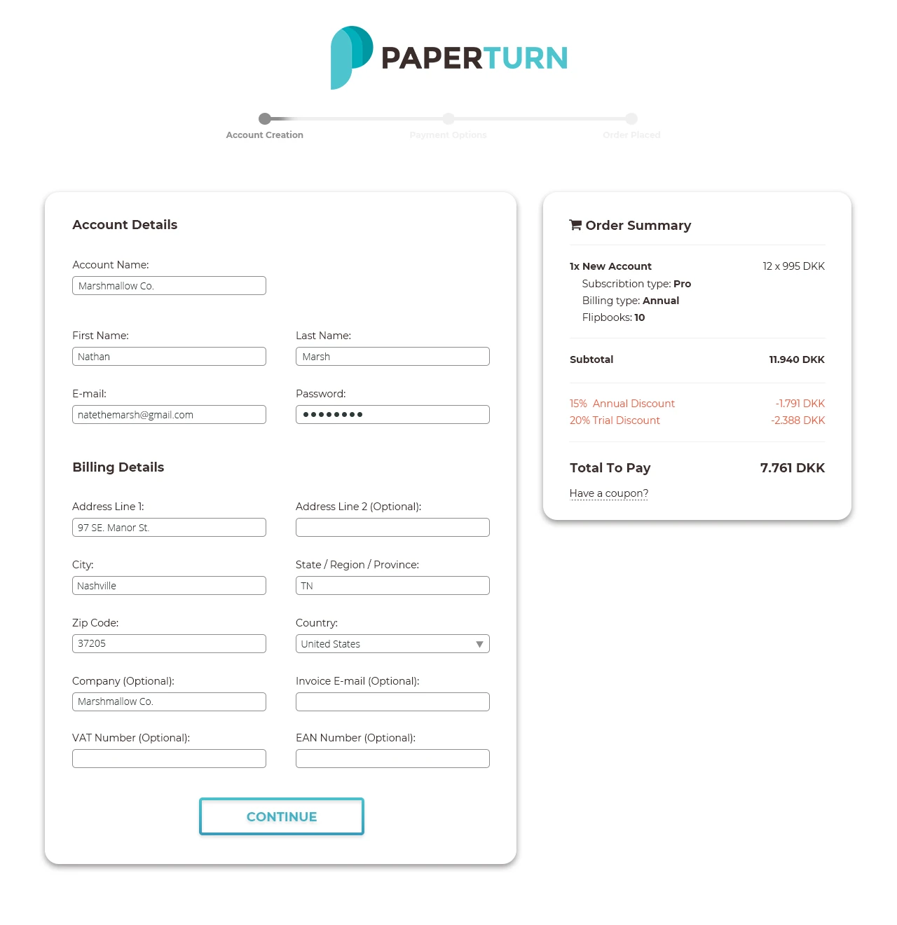
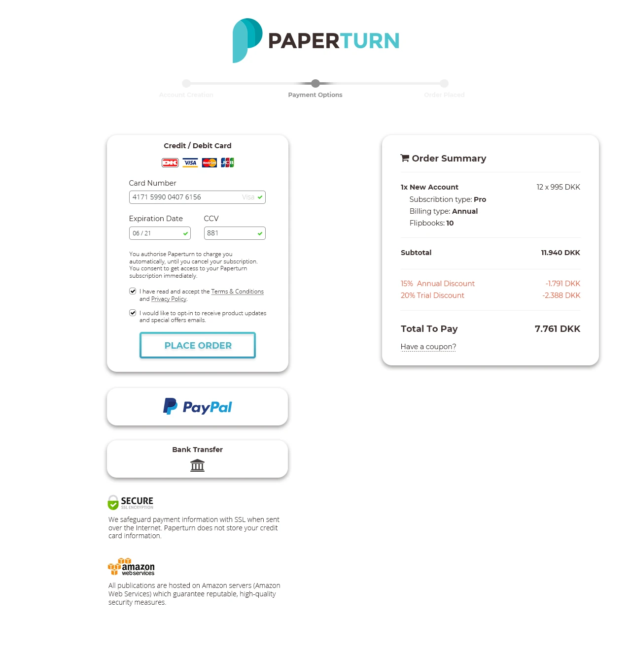
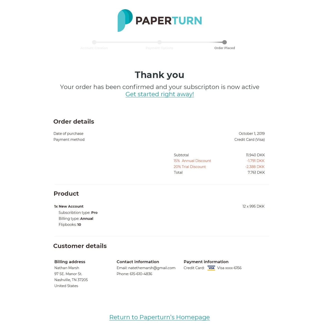
Once someone chooses a plan, the site menu disappears. The checkout shows only the logo, a three-step progress bar and an order summary that stays visible the whole way.
Account and billing details come first, payment second and confirmation last. Card, PayPal and bank transfer sit together in one list, with notes on secure payment and hosting below. The coupon field is a small text link, so it doesn't send people off looking for a discount code.
The research said to go from the simplest form to payment, and to make payment look safe. The flow follows both.
- 1 · Account & billing paperturn.com
- 2 · Payment paperturn.com
- 3 · Confirmation paperturn.com
Free trial
A trial sign-up that explains itself.
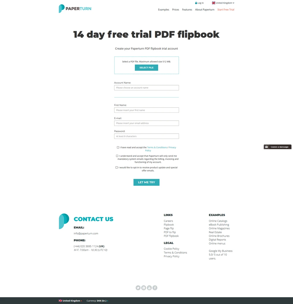
The old trial page was a plain column of form fields. In the redesign, uploading a PDF is the first, most visible step, the benefits and a device preview sit next to the form, and client quotes and logos underneath build trust.
Next to the form, a small device preview animates through example publications, so visitors see what their PDF will turn into before they fill in a single field.
Visitors see what they get before they're asked for anything.
Onboarding emails
The first emails a new user gets.
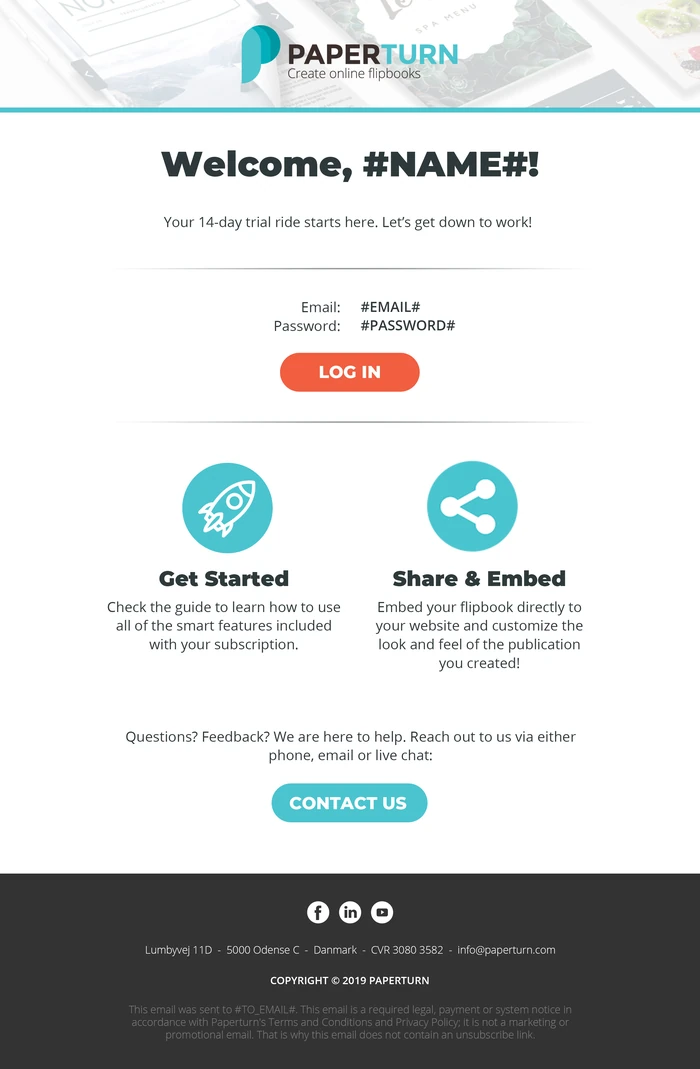
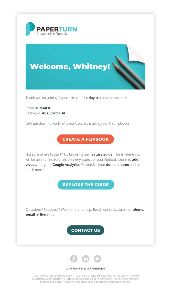
I designed the welcome email a new trial user receives: login details, one clear first action (create a flipbook) and a link to the feature guide.
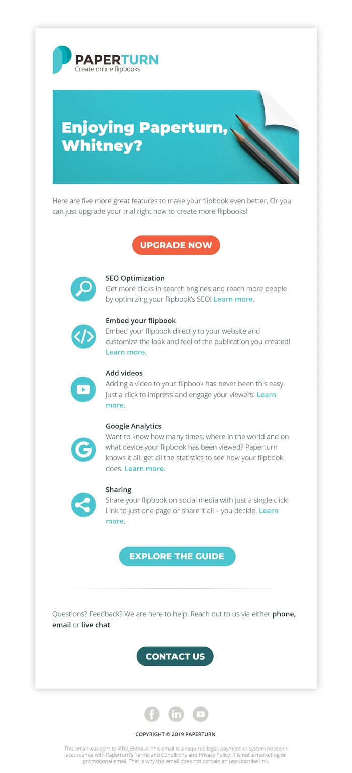
A follow-up email then nudges trial users towards upgrading, with short introductions to the features they haven't tried yet. Both share one simple template.
The first draft said too much. The final version asks for one action.
Outcome
Handed over, ready to build.
The designs were approved by the CEO and handed to Paperturn's developer for implementation.
- Delivered
- Pricing page, a three-step checkout, an animated trial sign-up page and two onboarding emails.
- Process
- Research notes first, then three pricing iterations with feedback from the CEO.
- Today
- Paperturn's website has been redesigned since, so the pages shown here are my 2019 designs, not the current site.
Recommendation from Paperturn
“Thomas completed his tasks efficiently and independently. […] He showcased his advanced skills in visual design, color theory and his keen eye for detail in creating a beautiful new design for our price page […]”