Fyns Brolægning ApS · Brand identity · 2024
Laying the first stone
A logo for a new paving company on Funen, designed from a one-line brief. Since autumn 2024 it has been on the side of the company's vans.
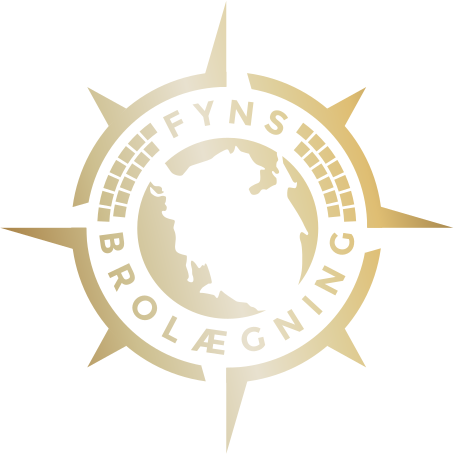
- Client
- Fyns Brolægning ApS (start-up)
- Year
- September 2024
- Role
- Sole designer
- Delivered
- Logo · ApS lockup · Badge · 3 colourways
The brief
One line of brief, full creative trust.
Fyns Brolægning was a brand-new paving company on Funen, started by my brother. His brief was one sentence: he needed a logo, and he trusted me with it.
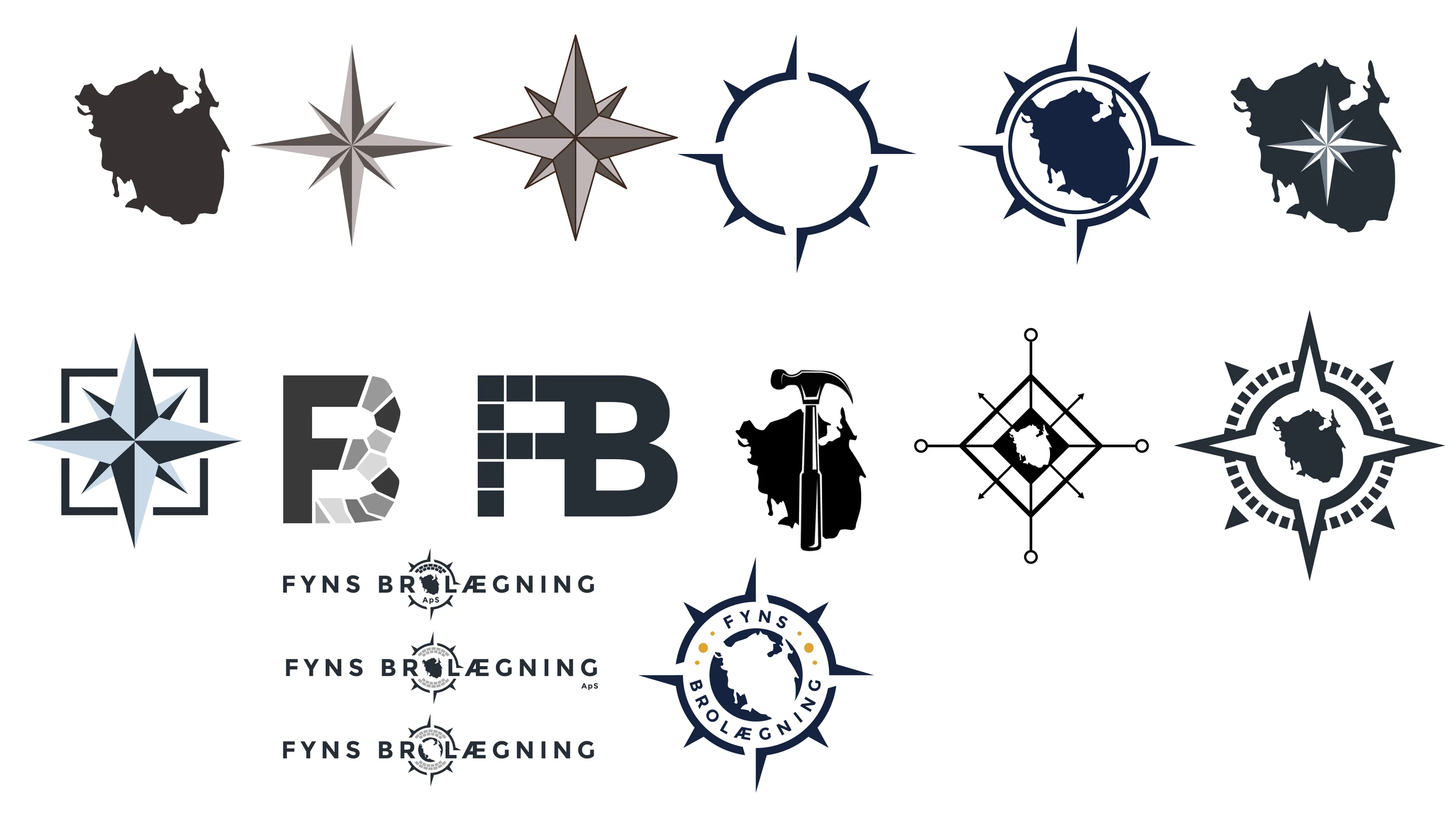
That much freedom still needs a direction. Before touching type, I explored symbols on their own: the outline of Funen, compass roses, paving-stone patterns and FB monograms. I was looking for imagery that could say where the company works and what it does.
A loose brief isn't the same as no brief. The first job was deciding what the brand should say.
Symbol meets type
Testing every symbol against the type.
Next, I paired the strongest symbols with two typefaces, one thin and one heavy, to see how each combination changed the character of the brand.
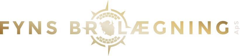
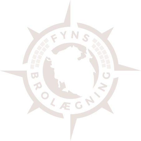
The final logo uses the heavier type in wide-spaced capitals, with the emblem taking the place of the O in BROLÆGNING. The emblem itself brings three ideas together: a compass, the island of Funen, and a ring of paving stones.
Where they work and what they do, in one mark.
The identity
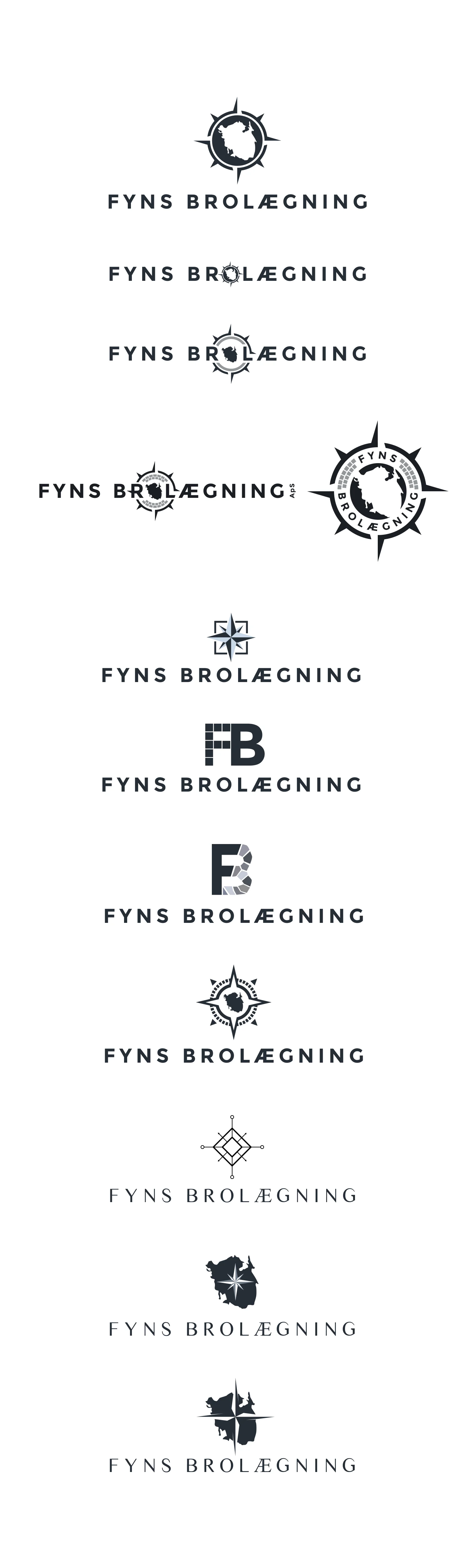
Gold for impact, black and white for everything else.
The identity comes as a horizontal logo, an ApS version and a round badge, each in gold, white and black. It has been in use since autumn 2024, including on the company's vans.